Choosing the perfect paint color for your living room is one of the most impactful decisions you can make for your home. It’s the space where you entertain guests, relax after a long day, and spend quality time with family. But with thousands of swatches available at your local hardware store, the process can quickly become overwhelming.
At CityBizLocal, we believe that creating a beautiful home starts with finding the right local experts and the right inspiration. In this comprehensive guide, we’ve analyzed current interior design trends and timeless classics to bring you the top 10 paint colors for your living room that will increase your home’s aesthetic appeal and value. We’ll discuss in brief the top 10 paint colors for your living room should be!
Why Does Choosing the Right Living Room Color Matter?
Your living room’s color palette does more than just cover the walls; it sets the psychological “temperature” of your home. A poorly chosen color can make a room feel cramped or cold, while the right shade can make a small space feel expansive and airy.
Furthermore, if you are looking to sell your home, a neutral and modern living room palette is one of the highest-value upgrades you can make. It allows potential buyers to envision themselves in the space, which is why “Real Estate Greige” remains a top search term.
1. Classic Off-White

Example: Benjamin Moore Simply White
White isn’t “boring”—it’s versatile. A warm off-white creates a crisp, clean backdrop that allows your furniture and artwork to take center stage. Unlike stark hospital white, an off-white with yellow or peach undertones adds a layer of softness.
- Best for: Rooms with plenty of natural light and eclectic decor.
2. Sophisticated Greige

Example: Sherwin-Williams Agreeable Gray
If you can’t decide between gray and beige, “Greige” is your answer. This color has dominated the SERPs for years because it works in almost any lighting condition. It provides the coolness of gray with the warmth of beige, making it a safe yet stylish choice for any suburban home.
3. Deep Navy Blue

Example: Hale Navy by Benjamin Moore
For those who want a touch of drama, navy blue is the new neutral. It’s sophisticated, grounding, and pairs beautifully with metallic accents like brass or gold. Using a dark color in the living room creates a “jewelry box” effect that feels cozy and high-end.
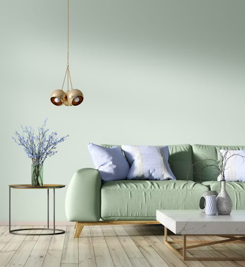
4. Soft Sage Green

Example: Farrow & Ball French Gray
As we move toward biophilic design (bringing the outdoors in), sage green has skyrocketed in popularity. It is a calming, earthy tone that promotes relaxation. Sage acts as a neutral but offers more personality than a standard tan.
5. Moody Charcoal

Example: Sherwin-Williams Iron Ore
Dark gray or charcoal walls provide a stunning contrast against light-colored flooring or white trim. It creates an intimate atmosphere perfect for a media room or a living room used primarily in the evenings.
6. Warm Terracotta

Example: Terra Rosa by Benjamin Moore
Warmth is making a massive comeback in interior design. Terracotta and clay-toned pinks add a Mediterranean or Southwestern feel to a home. These colors feel “sun-drenched” and inviting, perfect for making a large room feel more intimate.
7. Pale Sky Blue

Example: Sherwin-Williams Sea Salt
If you want your living room to feel like a spa, look no further than a watery, pale blue. This color is scientifically proven to lower stress levels. It’s particularly effective in smaller living rooms as it mimics the sky, making the ceiling feel higher.
8. Buttercream Yellow

Example: Farrow & Ball Hay
Yellow is a bold choice, but a soft, muted buttercream can make a room feel perpetually sunny. It’s an excellent choice for north-facing rooms that don’t get much natural sunlight.
9. Taupe and Sand

Example: Sherwin-Williams Balanced Beige
Moving away from the “cool gray” trend of the 2010s, sand-colored neutrals are back. These colors feel organic and “stony,” providing a solid foundation for a minimalist “Quiet Luxury” aesthetic.
- Best for: Minimalist interiors and high-traffic family rooms.
10. Deep Forest Green

Example: Hunter Green by Benjamin Moore
Much like navy, forest green offers a sense of heritage and luxury. It looks incredible when paired with leather furniture and dark wood tones. It’s a color that feels timeless yet trendy.
How to Test Paint Colors Like a Pro?
Before you commit to a gallon, you must test the color in your specific environment. Light changes drastically throughout the day.
- Use Peel-and-Stick Swatches: Brands like Samplize offer real paint stickers so you don’t have to mess up your walls with sample patches.
- Observe at Three Times of Day: Look at the color in the morning (natural light), afternoon (bright light), and evening (artificial light).
- Check Your Trim: Ensure the wall color doesn’t make your white trim look “dirty” or “yellow.”
Finding Local Painters
Selecting the color is only half the battle; the application is what makes or breaks the look. A professional paint job can last 10+ years, whereas a DIY job might show streaks and uneven lines within months.
If you are ready to transform your living room, CityBizLocal is your premier directory for finding top-rated painting contractors in your area. By hiring a local pro, you ensure:
- Expert Surface Prep: Proper sanding and priming for a long-lasting finish.
- High-Quality Materials: Professionals often have access to contractor-grade paints that offer better coverage.
- Local Accountability: Supporting local businesses helps your community thrive.
Final Thoughts
The best paint color for your living room is ultimately the one that makes you feel at home. Whether you choose the safety of Agreeable Gray or the boldness of Hunter Green, these top 10 colors are proven winners in interior design.
Stay tuned to the CityBizLocal for more home improvement tips, local business spotlights, and expert advice on making your house a home.


This is my first time pay a quick visit at here and i am really happy to read everthing at one place